Cincinnati Zoo
Integrated Campaign
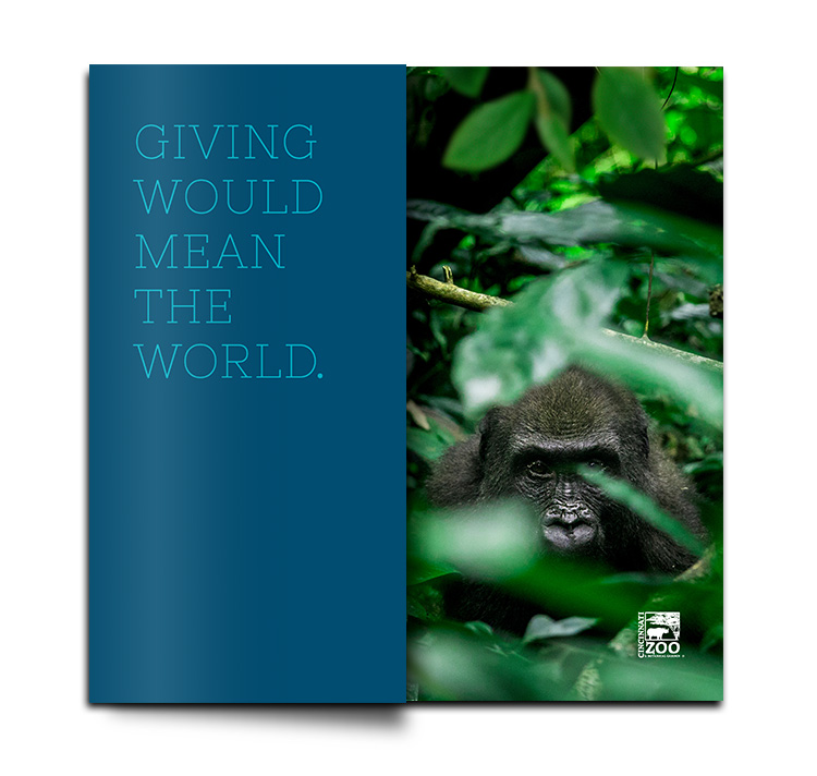
Saving species. And the world.
CHALLENGE: Create a campaign to inspire potential donors to give to the Cincinnati Zoo and Botanical Garden’s More Home to Roam $150 million capital campaign.
IDEA: Use storytelling and powerful imagery to captivate and educate audience on why giving would quite literally mean the world.
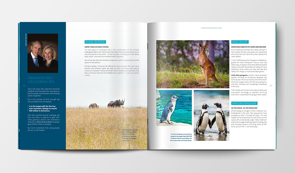
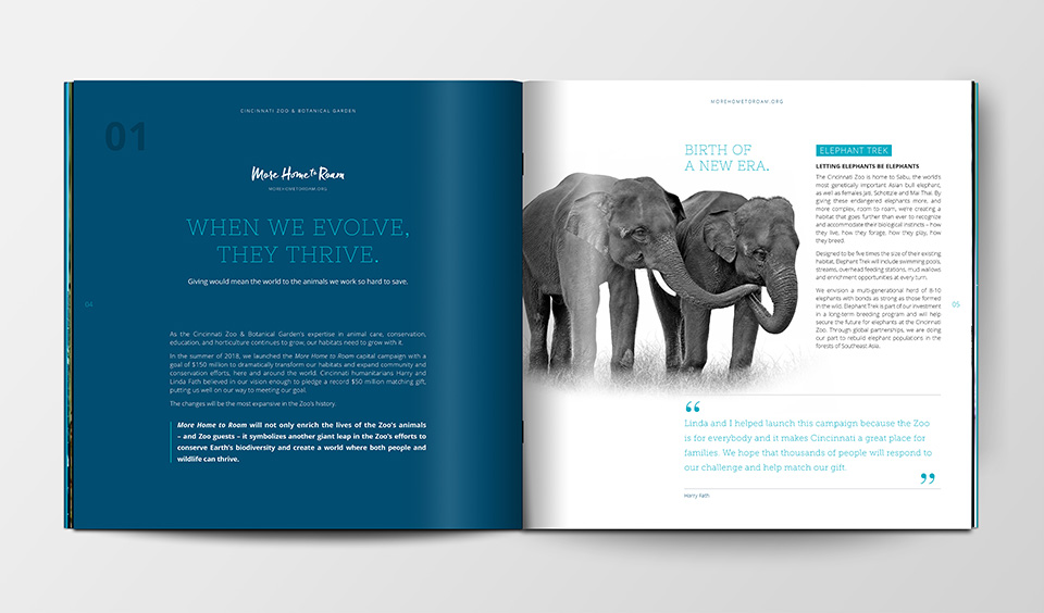
STORY: Launched in 2018 with a goal of $150 million, the Zoo’s More Home to Roam capital campaign will dramatically transform their animal habitats and expand.
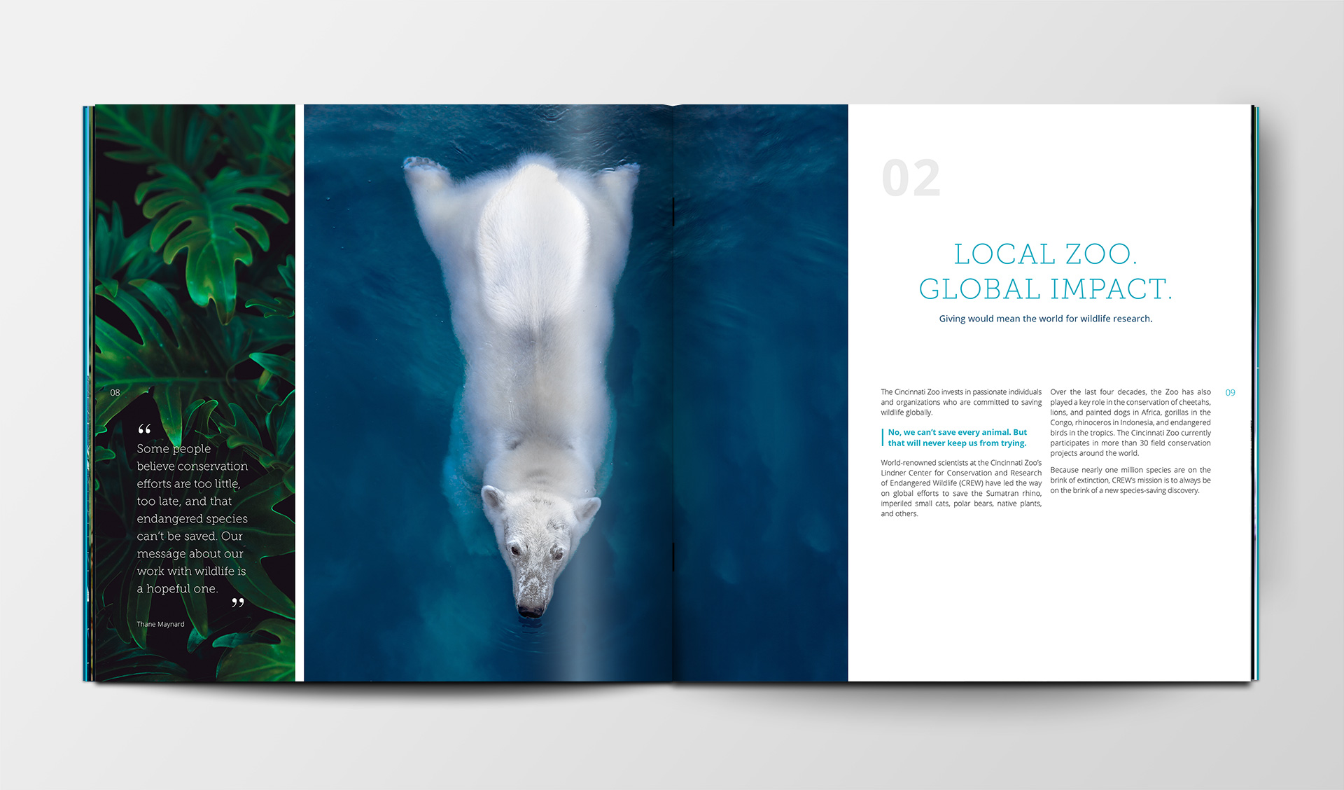
While the Zoo’s initial messaging focused on how habitat expansion would improve both the animals’ and visitors’ experience, Creative Department worked closely with the Zoo to dig deeper into everything the campaign would mean. What we learned was that the Cincinnati Zoo plays a leading role in the conservation of endangered species around the world. In fact, if it weren’t for the Cincinnati Zoo, some species would be much nearer to extinction.
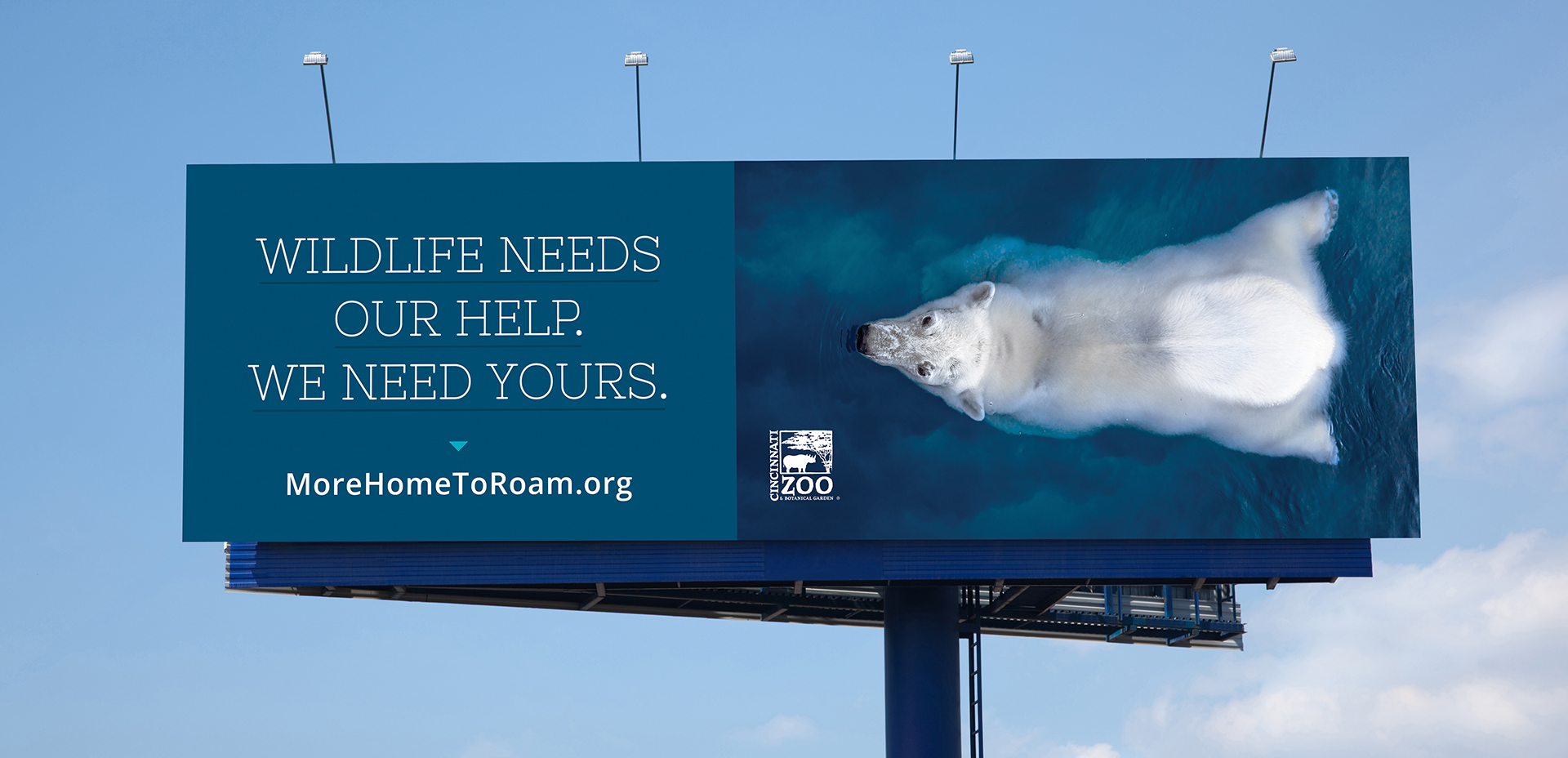
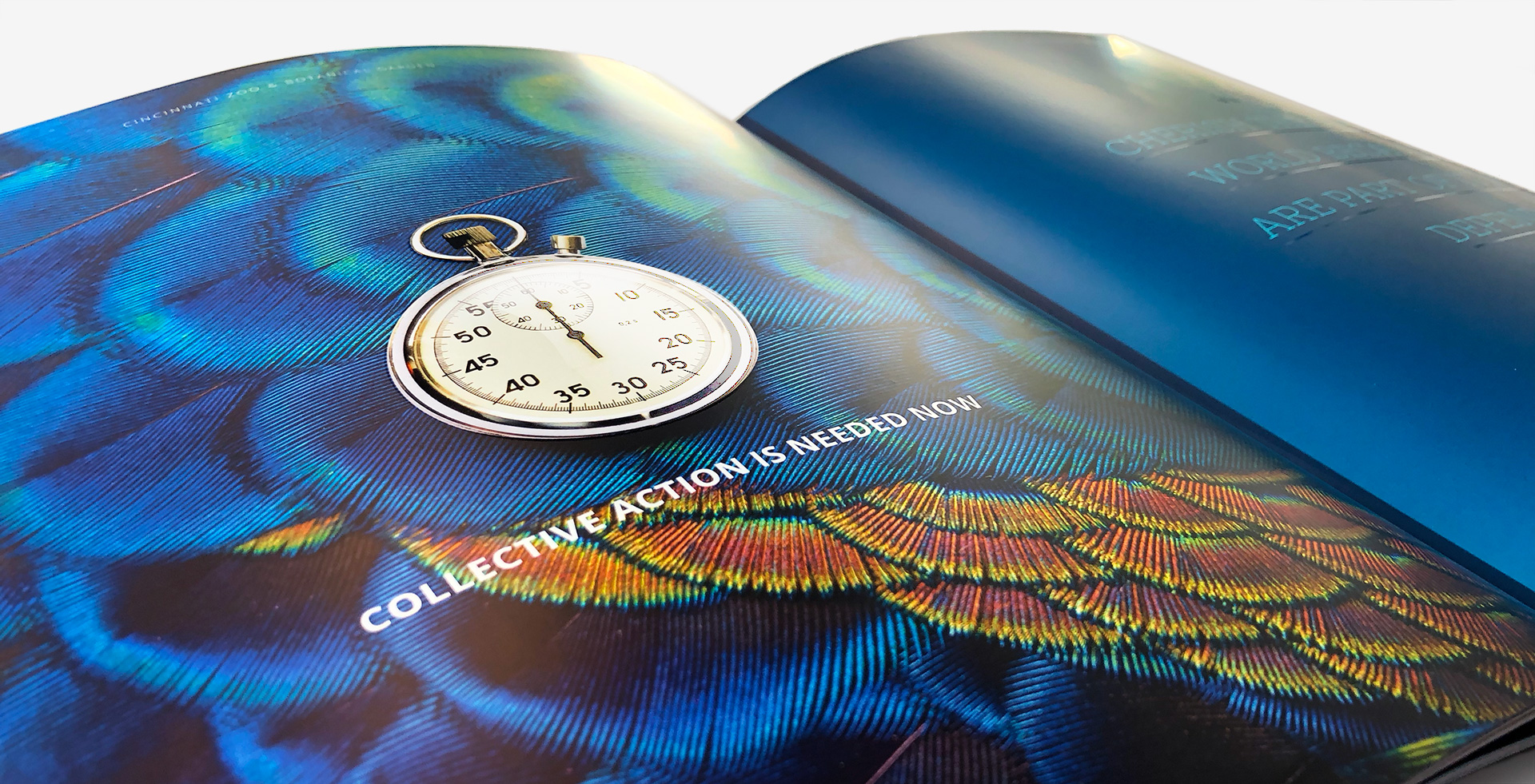
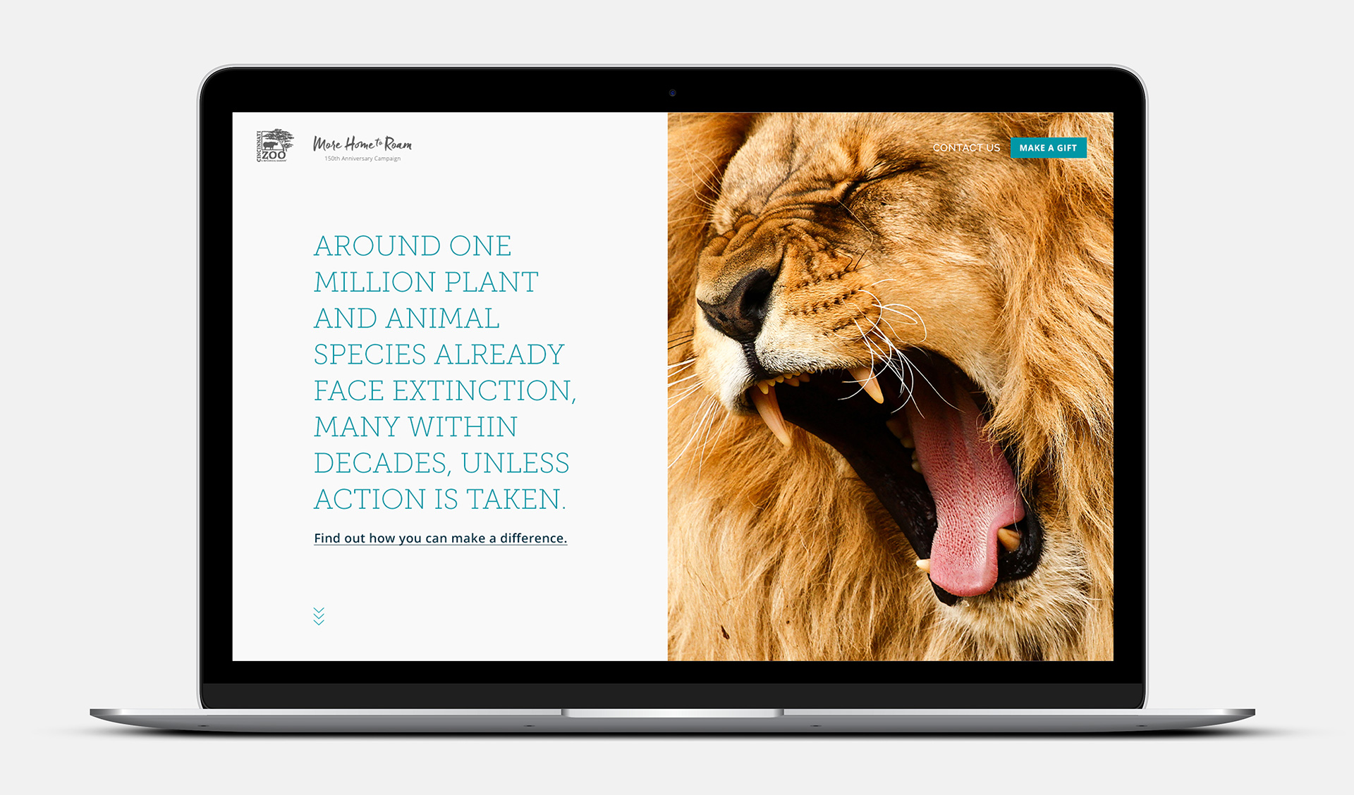
Shortly after our work on the project had begun, a United Nations Biodiversity Report sounded the alarm that nearly one million species face extinction, many within decades, unless action is taken.
The urgency of the UN Report delivered clarity and confirmation for our messaging: the Cincinnati Zoo’s conservation expertise has never been more important. The More Home to Roam improvements would not only increase the reproduction and well-being of endangered animals at the Zoo, campaign donations would multiply its global conservation efforts.
Storytelling was needed to shine a light on the campaign’s greater importance: giving would truly mean the world.
Storytelling was needed to shine a light on the campaign’s greater importance: giving would truly mean the world.
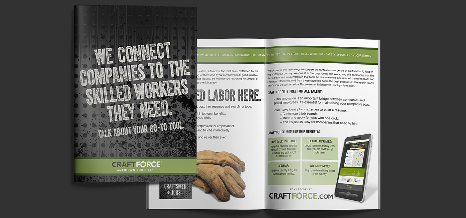
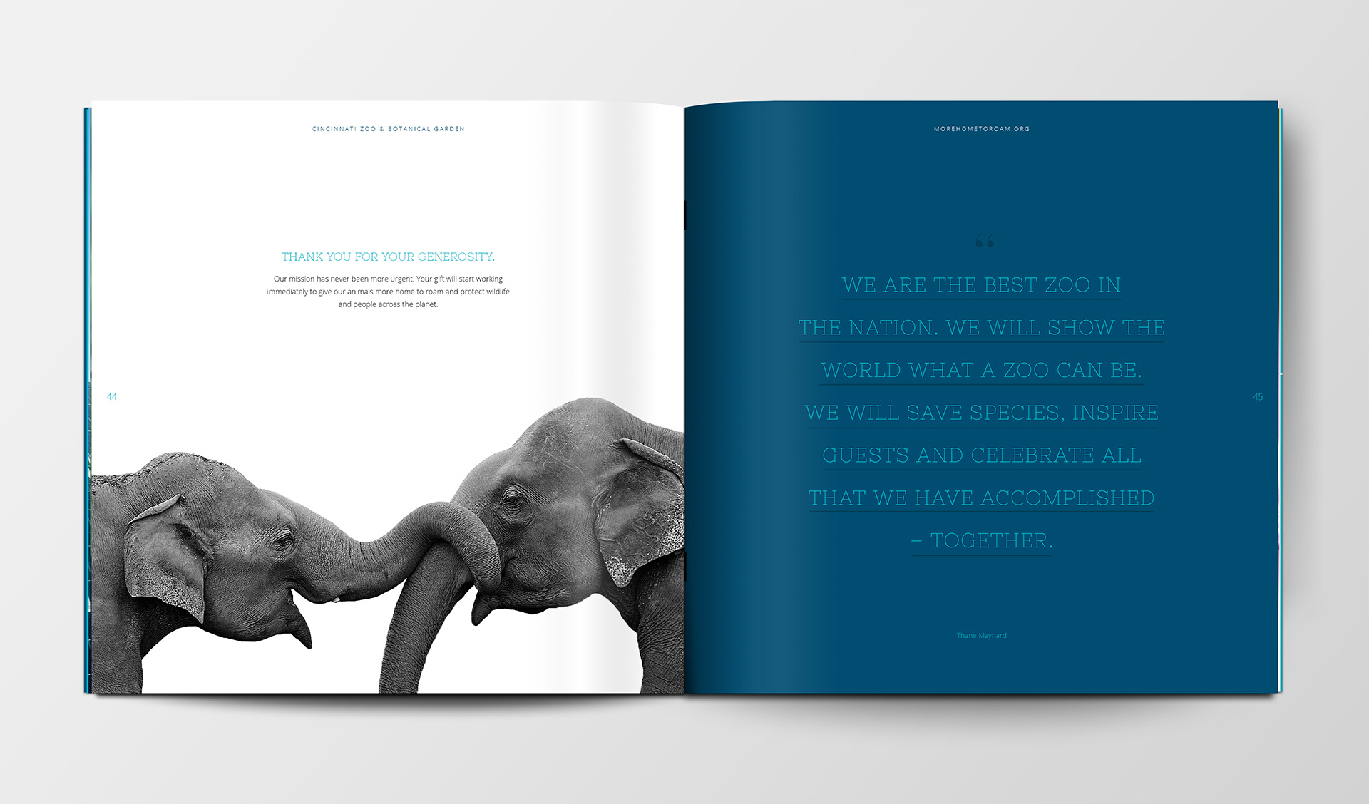
A 44-page, oversized full-color brochure gave likely donors a fresh, close-up look at the Zoo, its mission, and the More Home to Roam campaign.
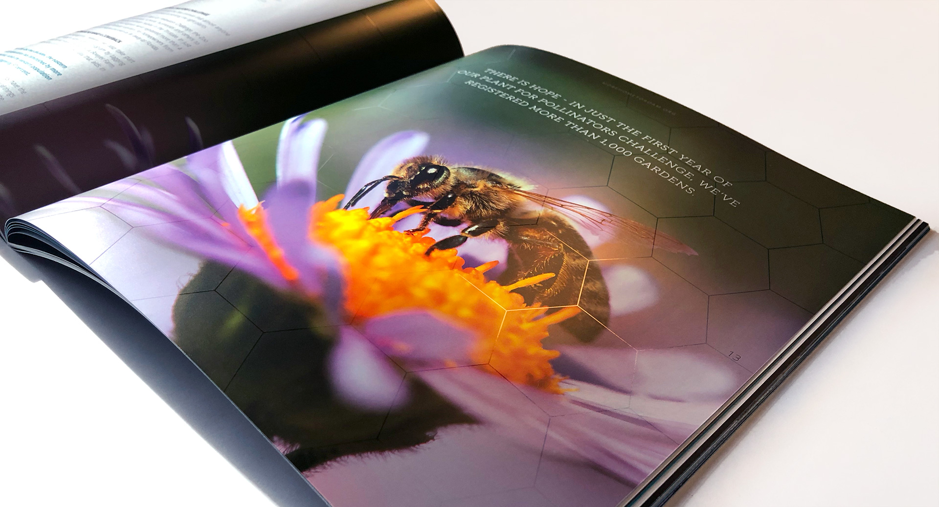
A rich color pallet and distinctive UV spot varnish underscored the power and beauty of the wildlife the Zoo works so hard to save.
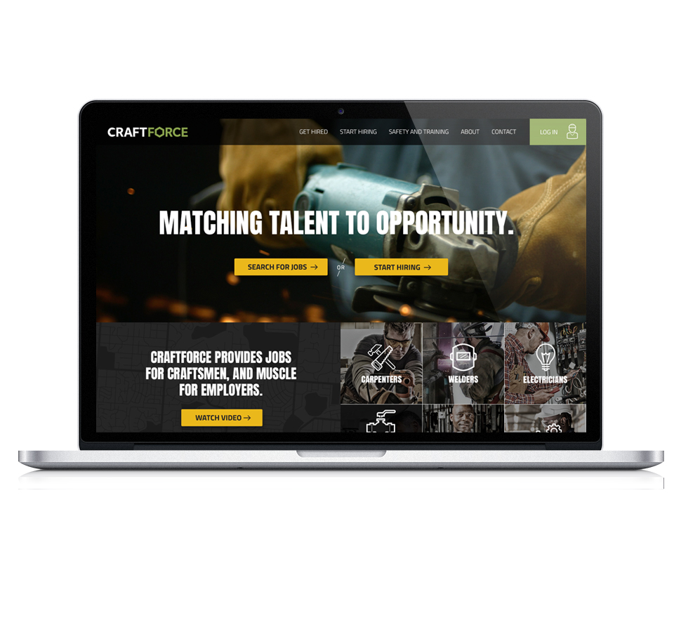
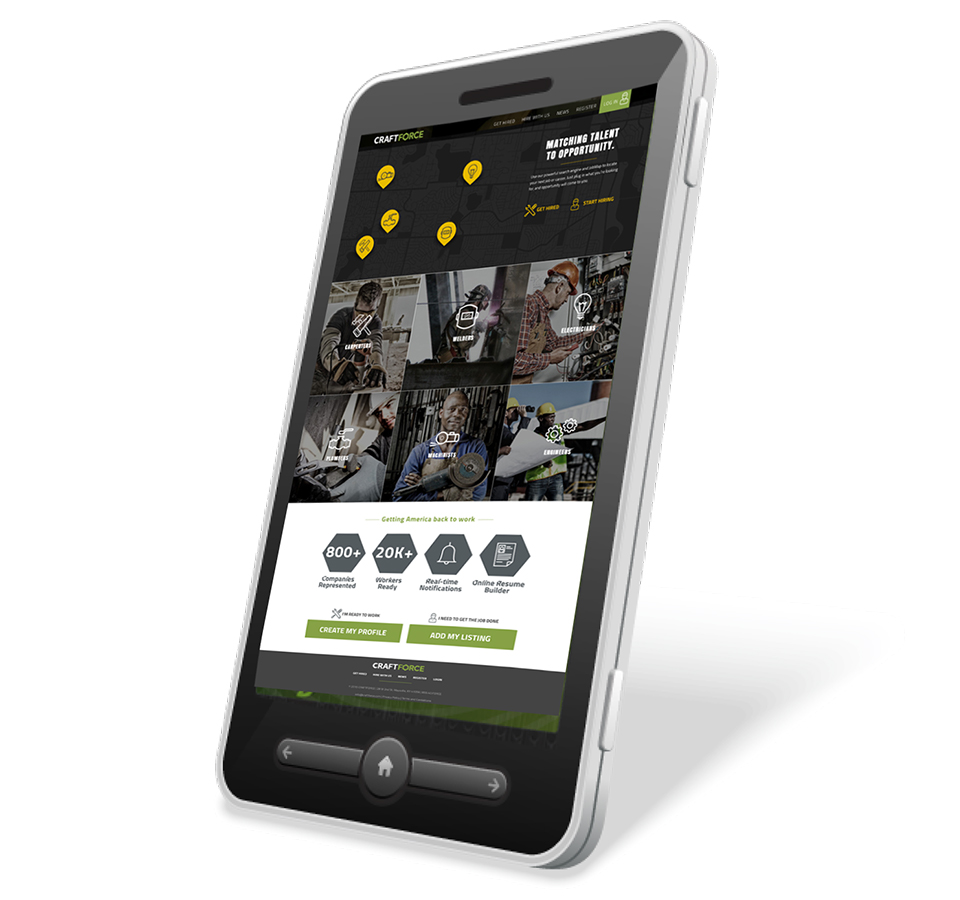
An accompanying website reached a wider audience, providing strong messaging support with a quick way to donate.
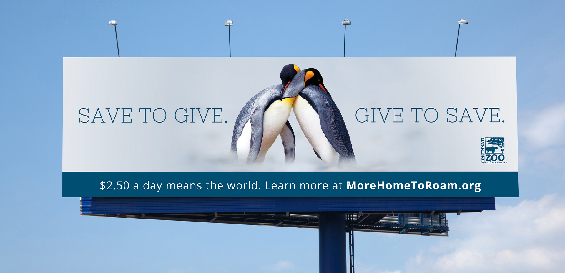
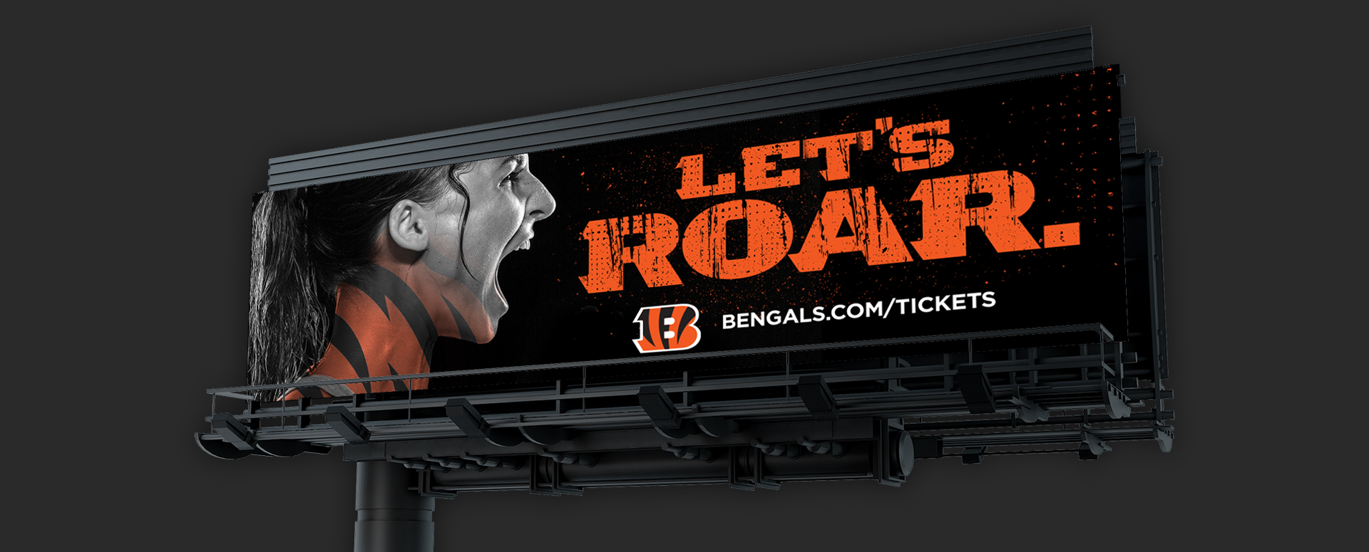
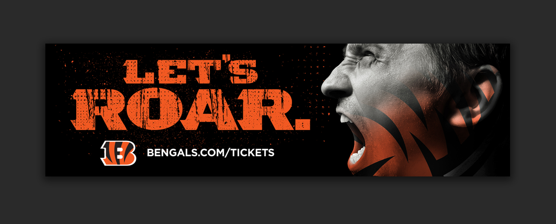
Outdoor stressed the urgency of giving.