Three Oaks by Neyer Properties
Brand Identity
A strong brand from the ground up.
CHALLENGE: Create the brand identity and foundational messaging for a neo-urban, multi-generational residential community being developed in the Oakley neighborhood of Cincinnati. The community would be the first of its kind in the area.
IDEA: Tap into the rich history and geography of the development site to inspire the name, logo and messaging.
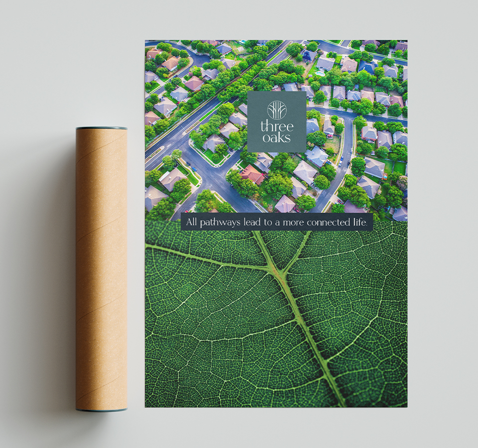
STORY: Three Oaks is a planned 30-acre residential community by Neyer Properties, scheduled to open in the fall of 2021. Designed to be vibrant, inclusive, and unlike anything else in the area, Three Oaks will feature beautiful architecture, ample and lush park-like common spaces, and hike and bike paths for easy connection to the surrounding community – an ideal example of “new urbanism.”
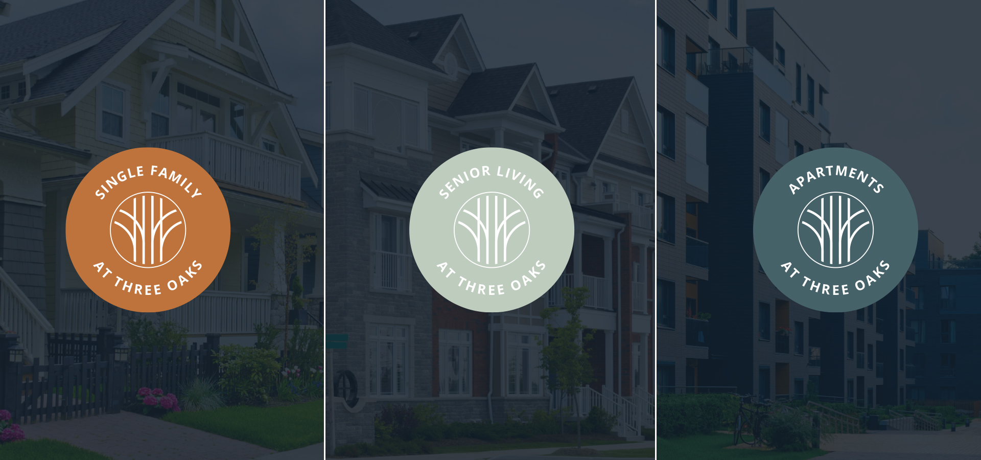
Highly progressive, yet with a nod to history, Three Oaks will accommodate families in all phases of life with three separate types of residences: multi-family homes (apartments and townhouses), single-family homes, and senior living which includes independent living, assisted living, and memory care.
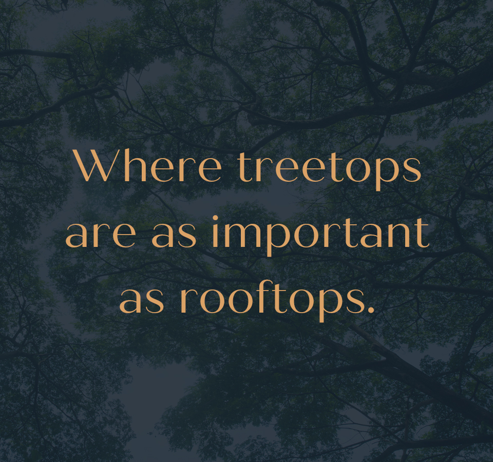
To create the brand identity, we looked to the site’s past as well as its future. Our naming exploration included researching the origins of the city of Oakley itself – which owes its name to the many oak trees within its limits. The trees’ legendary strength, beautiful canopy and resilient root systems are all characteristics reflective of the quality of the community’s exciting neo-urban design.
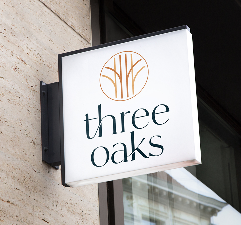
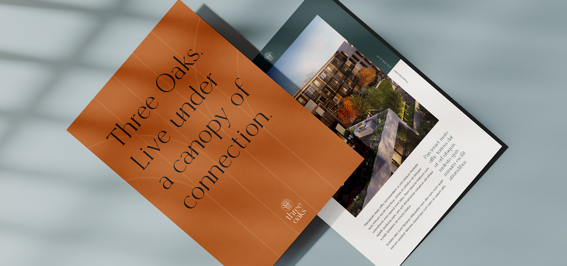
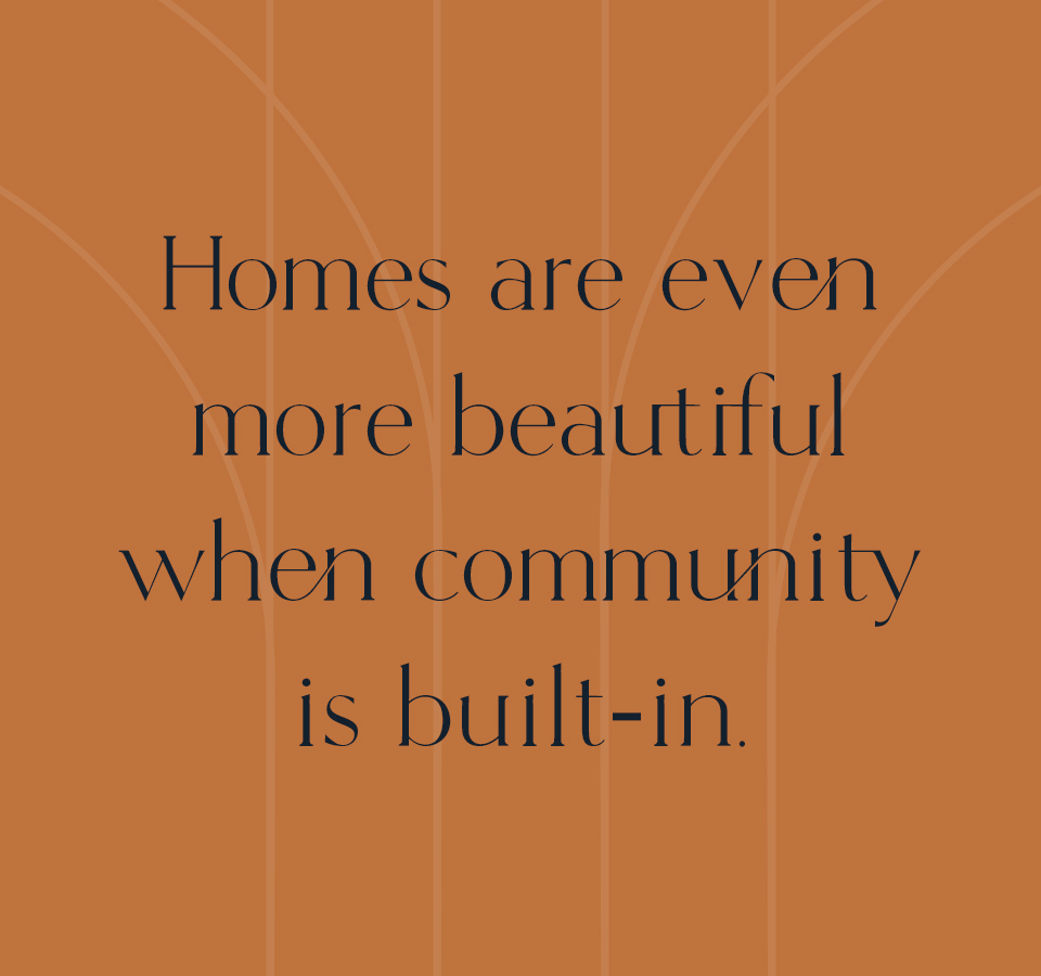
The tall straight lines of the logo suggest the trunk of an oak while its branches reference the site’s history of connection – it was once a bustling railyard – as well as its new purpose of bringing together people who want to live a healthy, active life of community and connection. In addition, messaging – from the tagline to headlines – also communicate growth and connectivity.
For Neyer Properties, growth is a recurring theme, as enthusiasm and anticipation for this unique community is quickly expanding throughout the Cincinnati area.


From the tagline to headlines, messaging includes references to growth and connectivity.


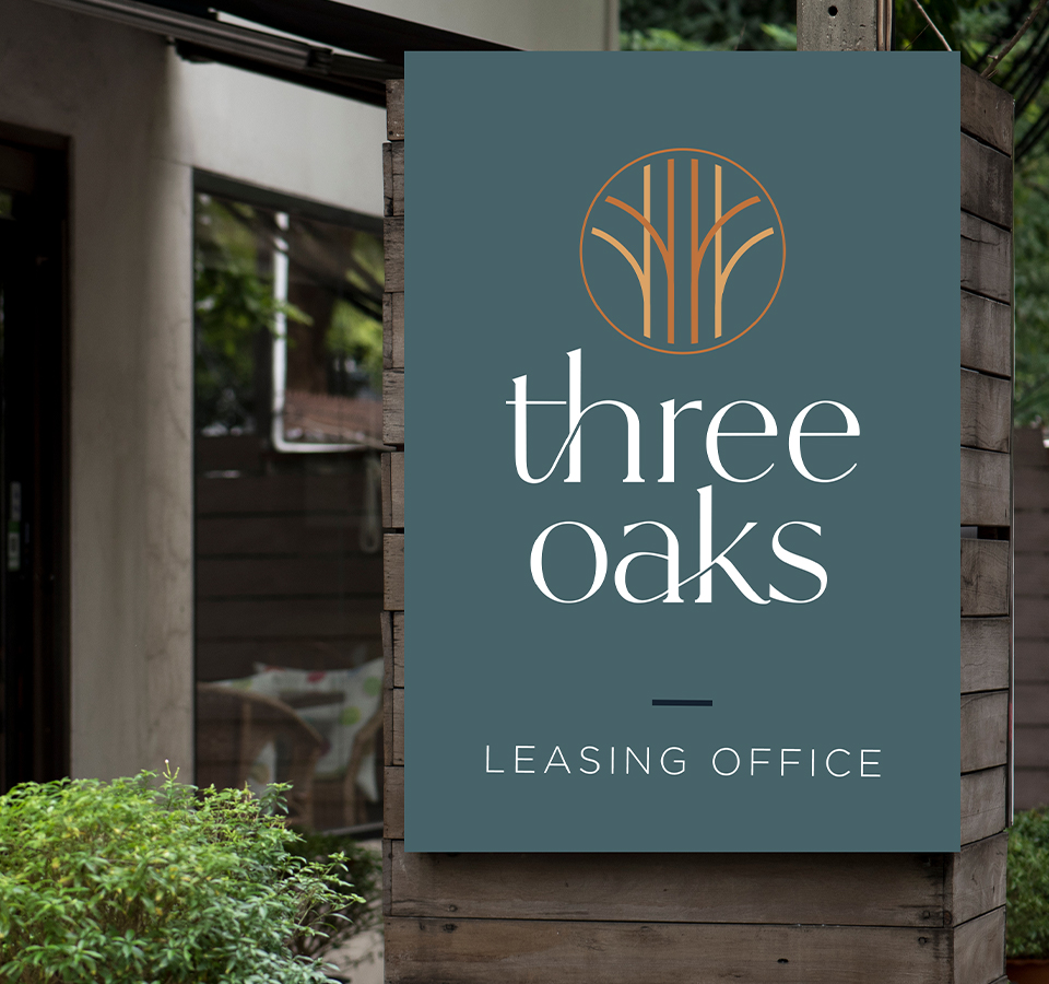


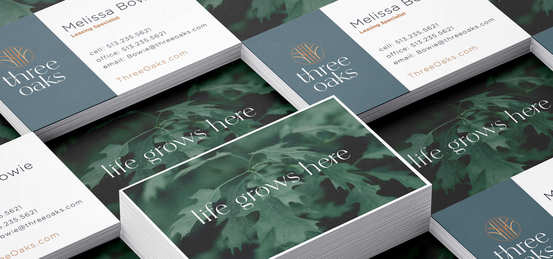
The tall straight lines of the logo suggest the trunk of an oak while its branches are a reference to the site’s history of connection – it was once a bustling railyard