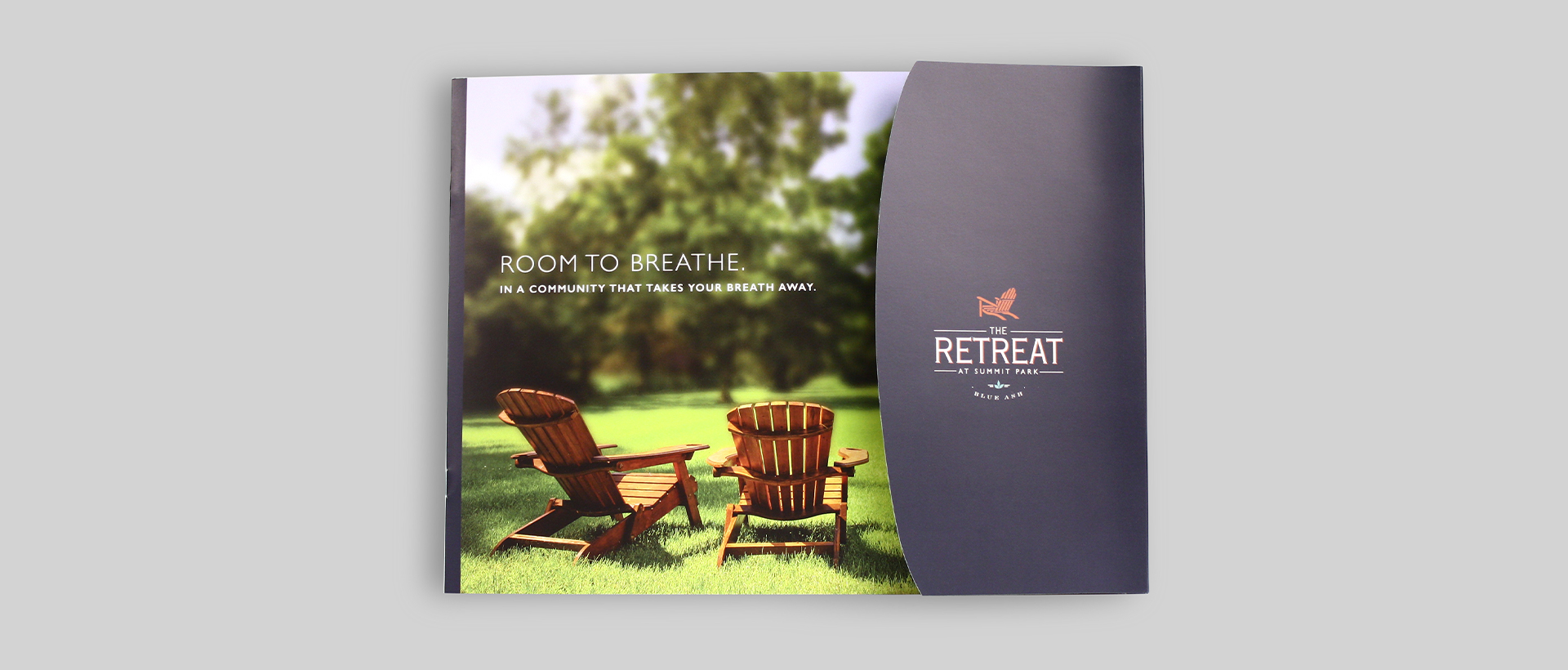
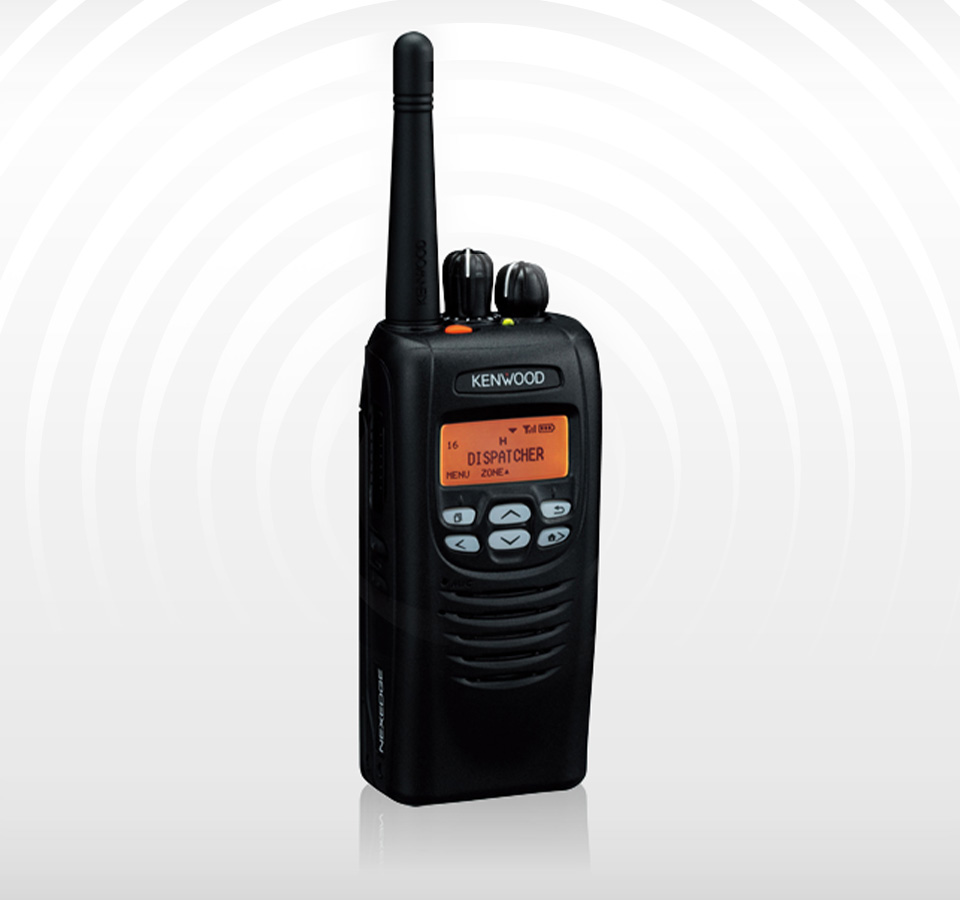
DCG Radio
Digital Design
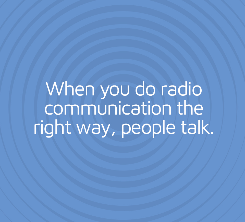
Diversified Communication Group saw opportunity in a stronger digital presence. So we turned up the volume.
CHALLENGE: For more than 30 years, Diversified Communications Group (DCG) quietly provided radio communication for companies across America. But under new ownership, DCG wanted to increase the power in their digital communication, and grow awareness. These efforts will result in business growth.
IDEA: DCG wants to be known in their territory as the top provider of two-way radio communications solutions. For a small company, competing against major players, that’s a big ask. But our idea was to make DCG appear larger than they are through a website redesign and SEO.
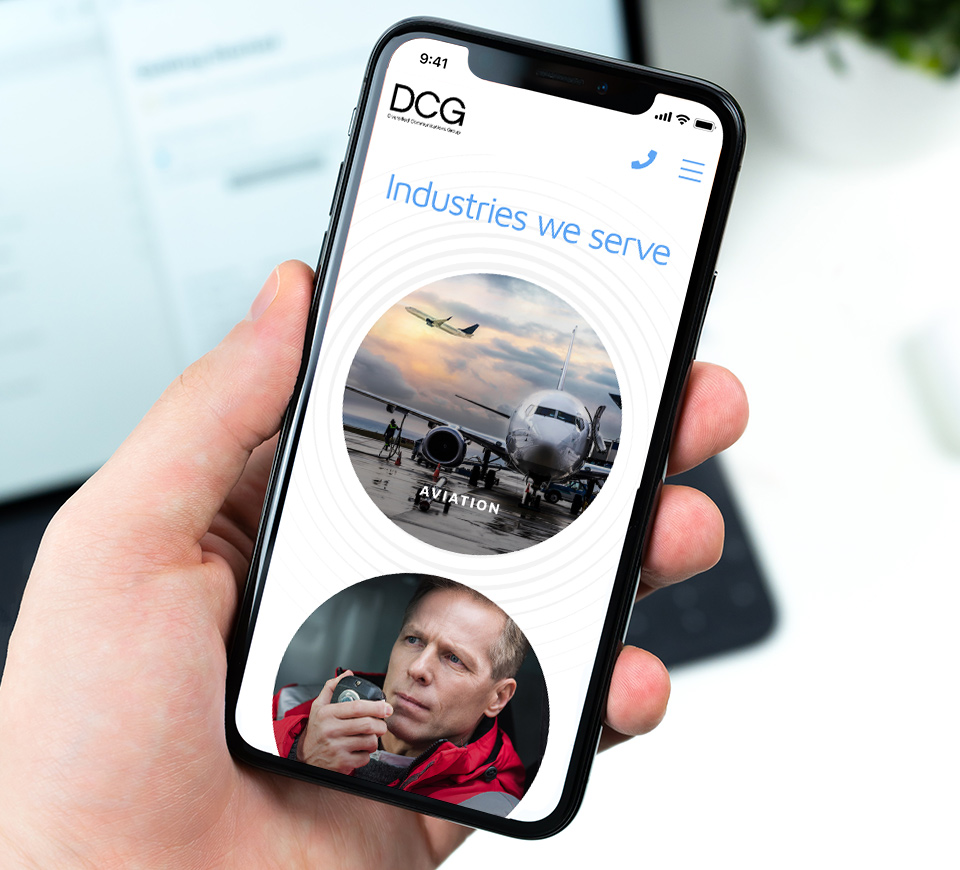
STORY: Diversified Communications Group (DCG) is a high-quality two-way radio communication solutions company with over 30 years of experience serving clients in a wide variety of industries including aviation, healthcare, public safety, transportation, hospitality, and manufacturing. But their website didn’t communicate the strength and depth of the company.
Their unique selling proposition is that they create long-term relationships with clients, and provide whatever is needed in the way of service. For example, the company’s owner has a cell phone with him 24-7 and he never turns it off. If there’s an emergency in the middle of the night, DCG goes to work in the middle of the night. But this was another element that was under-communicated.
Clearly, they needed an improved website, start to finish, elevating the design and distilling the user experience for the brand to build confidence, gain stronger awareness of the unique offerings and generate engagement/interest from the target audience. DCG wants to be known in their territory as the top provider of two-way radio communications solutions.
Their target audiences are quite broad. While 70% of their business is within the aviation industry, they also provide radio communication for healthcare, hospitality, security, transportation and commercial operations such as Amazon.
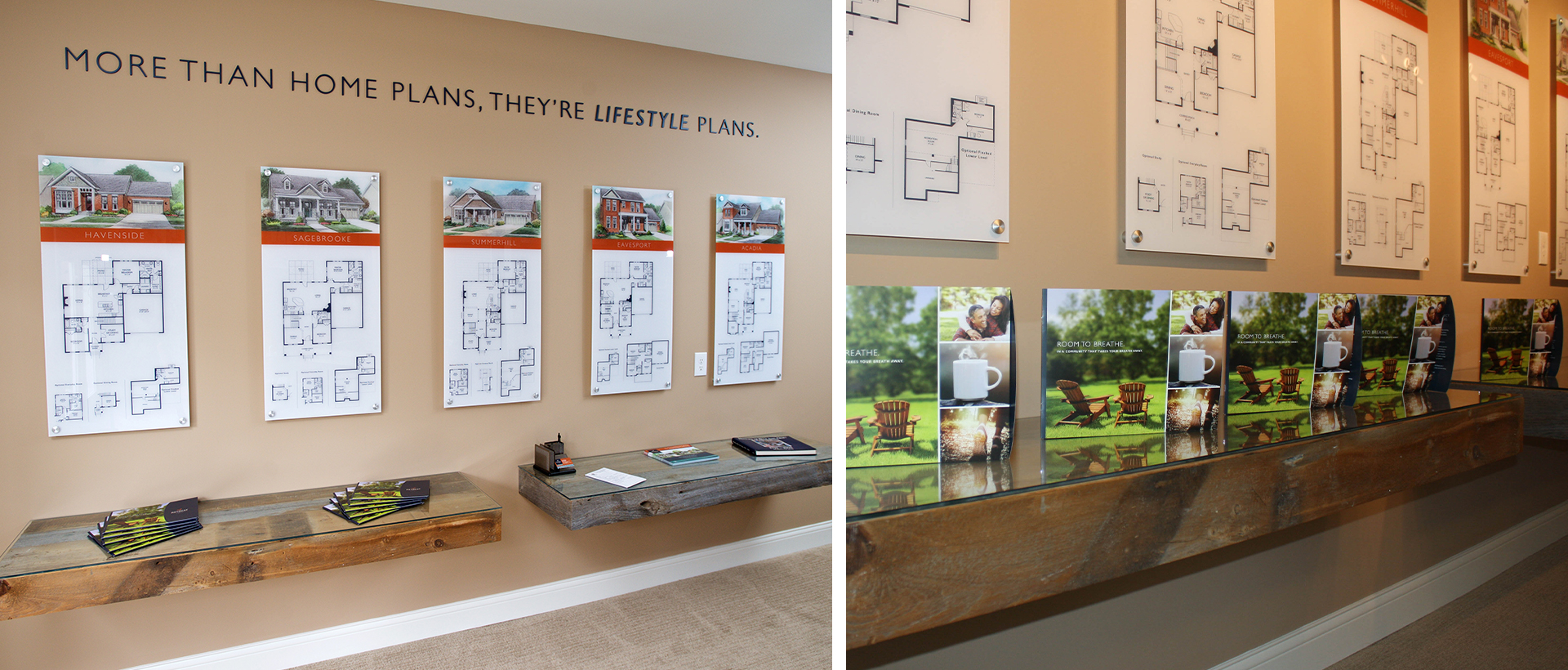
We started with content planning and big ideas, created both sitemap and wireframes, as well as an SEO plan. The overall design was modernized and simplified. We strengthened the brand expression through improved case studies, high-impact photography, and benefit-driven messaging. Additionally, we created the site to become utilitarian — an informational resource for those using radio communication. Through these measures, DCG has a better opportunity to grow their business.
The DCG website was lacking in solid communication of who they are. But through our improvements, their strengths – decades of experience, drop-everything service, and technological acumen – come through in shining fashion. DCG isn’t a large company presently, but we believe that will be changing very soon.

Search engine optimization helped DCG’s campaign come through loud and clear.