Haag-Streit Reliance
Campaign | Branding | Video | Digital Design
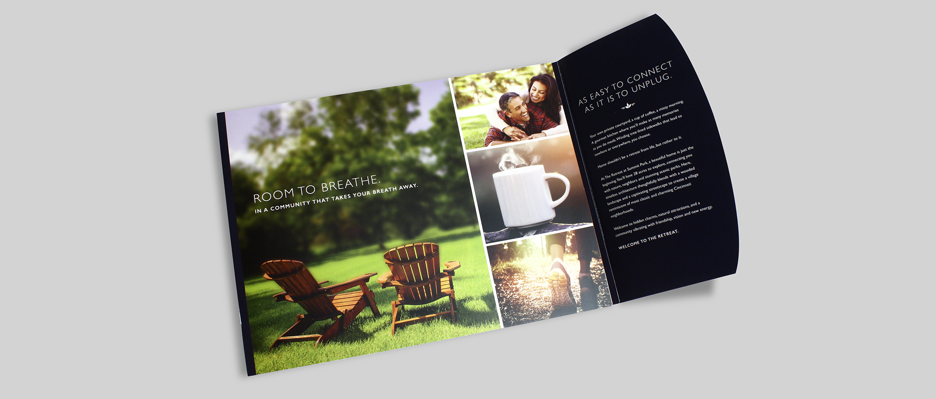
Built to last. Designed to love.
CHALLENGE: Reliance Medical Products exam chairs have long been known for their durability and reliability. We were tasked with launching a brand-new lineup of chairs that shifted the focus to style: they featured sleek new designs with a variety of upholstery options. Our target was physicians who care about the “aesthetics” of their office. This time, it was all about the look.
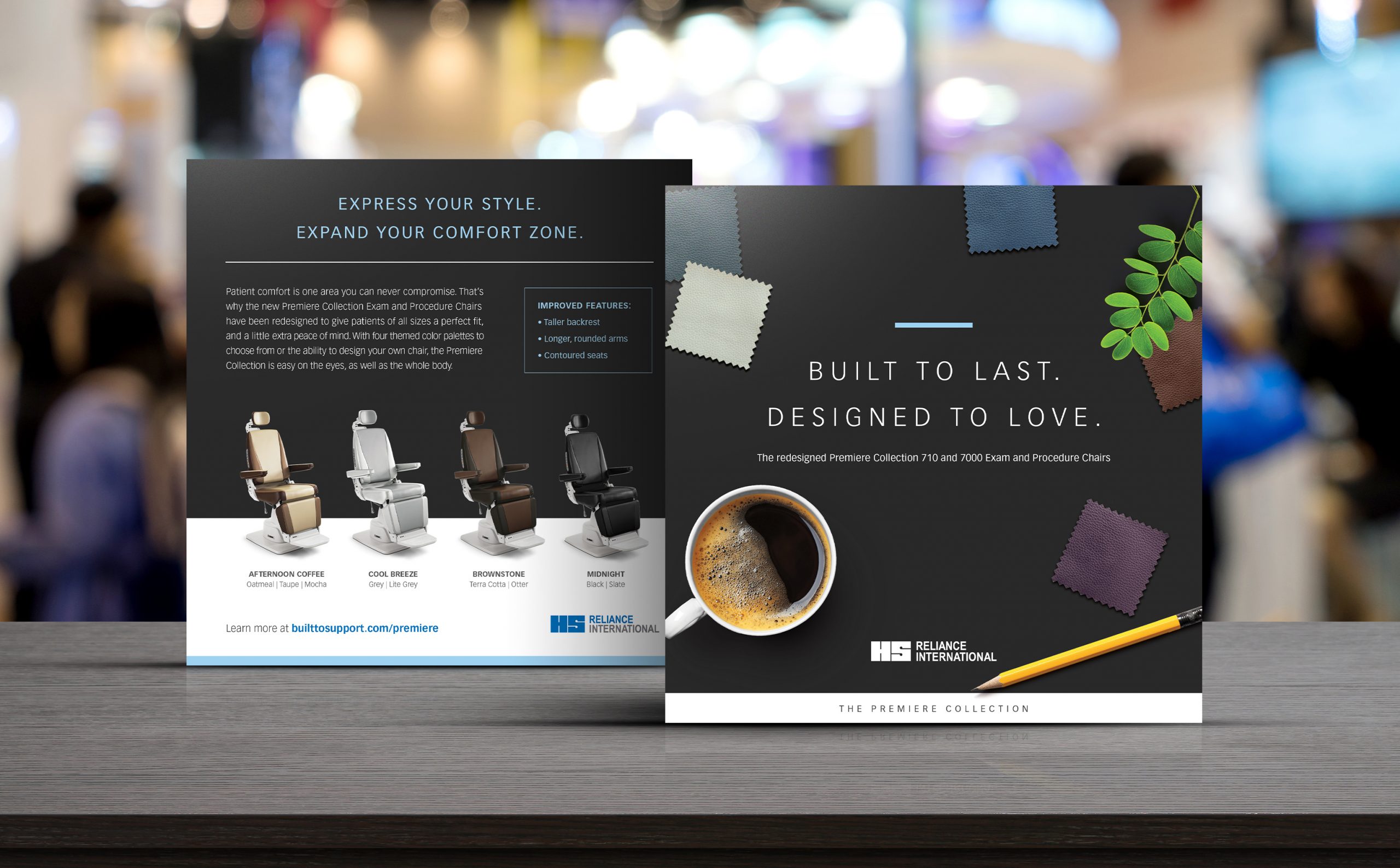
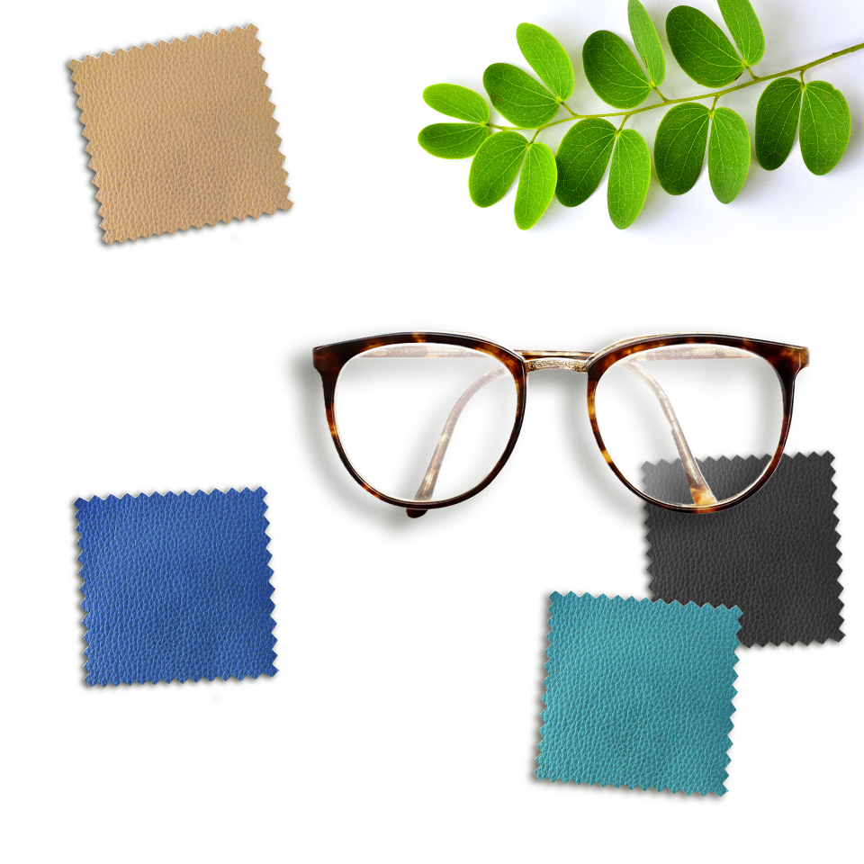
IDEA: The big idea was to compare the chair’s sleek look to trends in retail interior design, promoting the chair’s high end, premium look and feel. Customization was also key to the initiative. These chairs were “Built to last. Designed to love.”
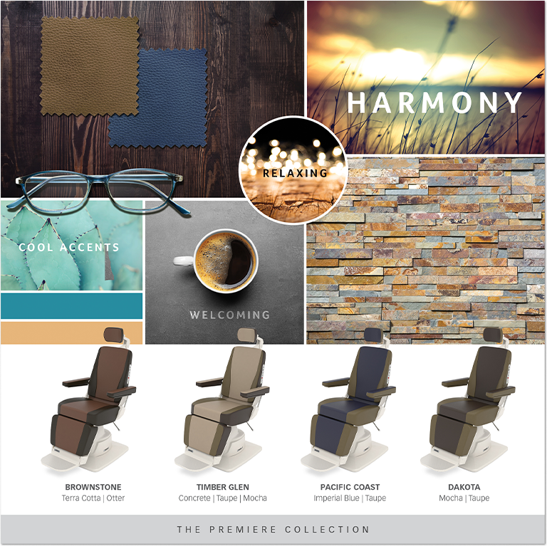
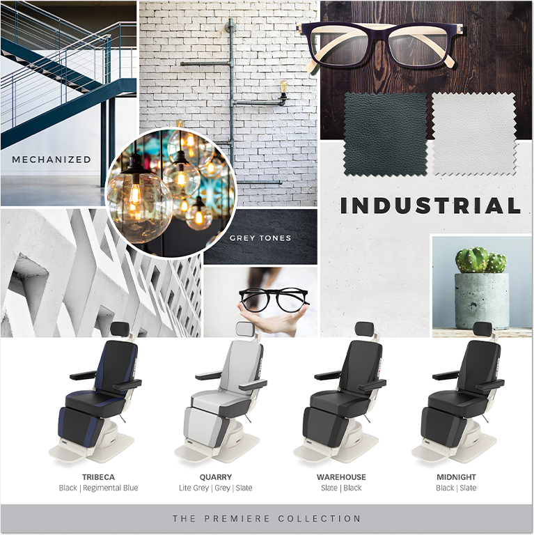
STORY: Doctor’s offices don’t usually scream “style,” but the Premiere Collection sought to change that. New design themes plucked from spa and retail environments brought beautiful, modern aesthetics to Reliance’s already durable and reliable procedure chairs.
In every way, the Premiere Collection was a new opportunity for doctors to draw patients to their practices. The only thing left to do was convince practice owners that decades-old interior design didn’t have to be their future.
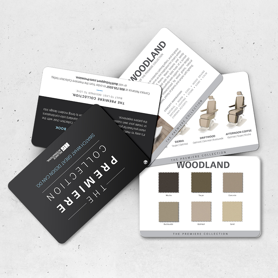
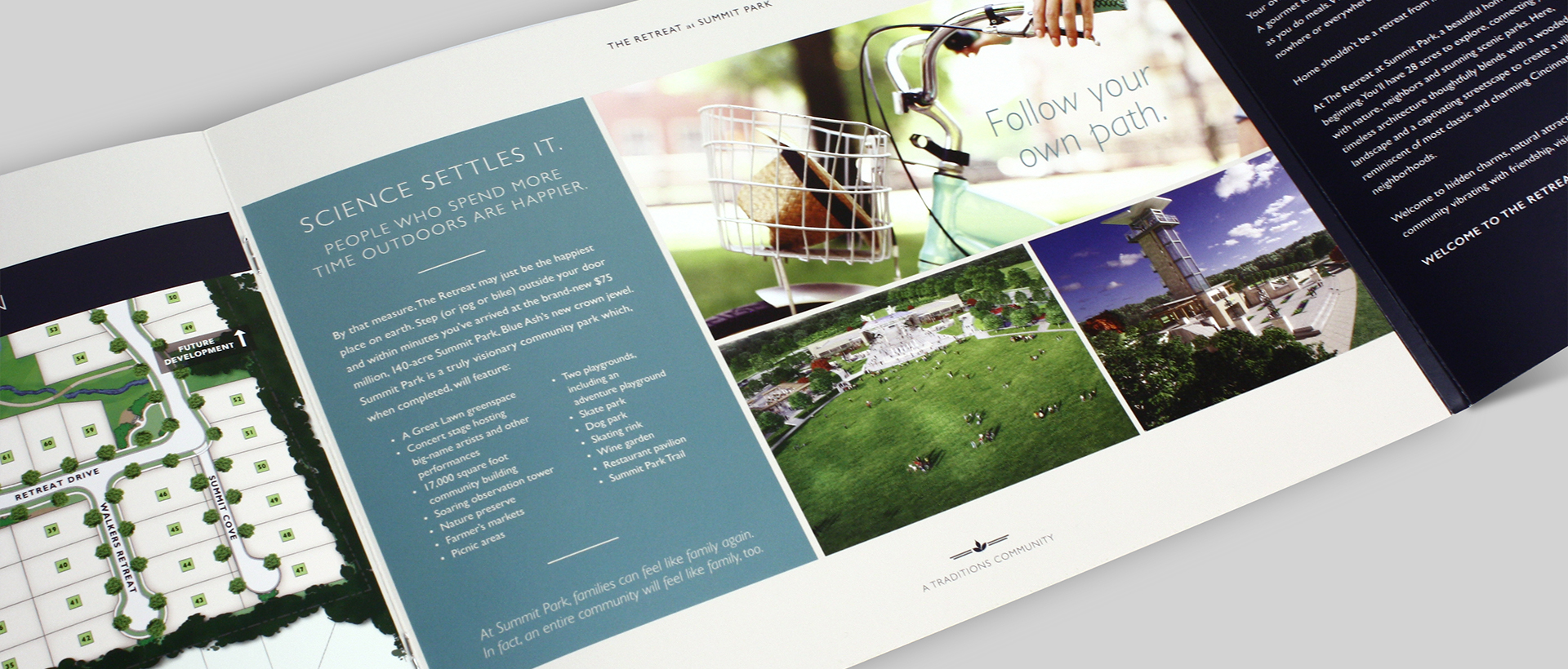
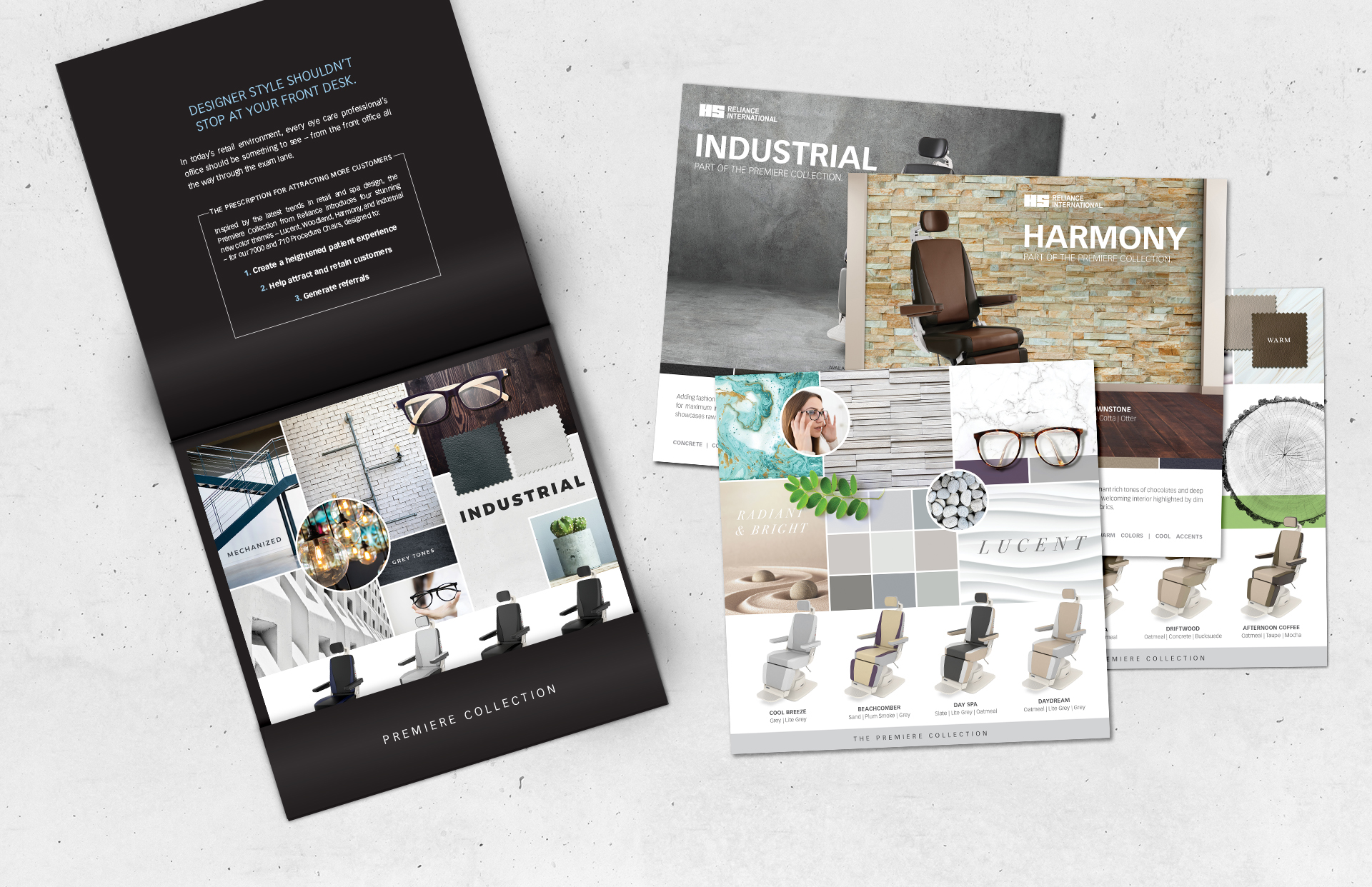
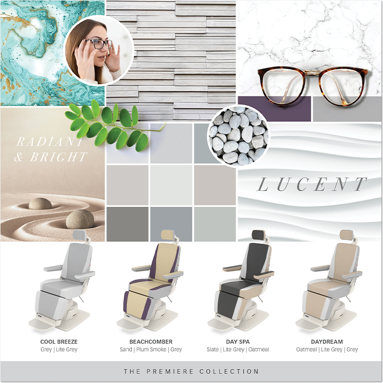
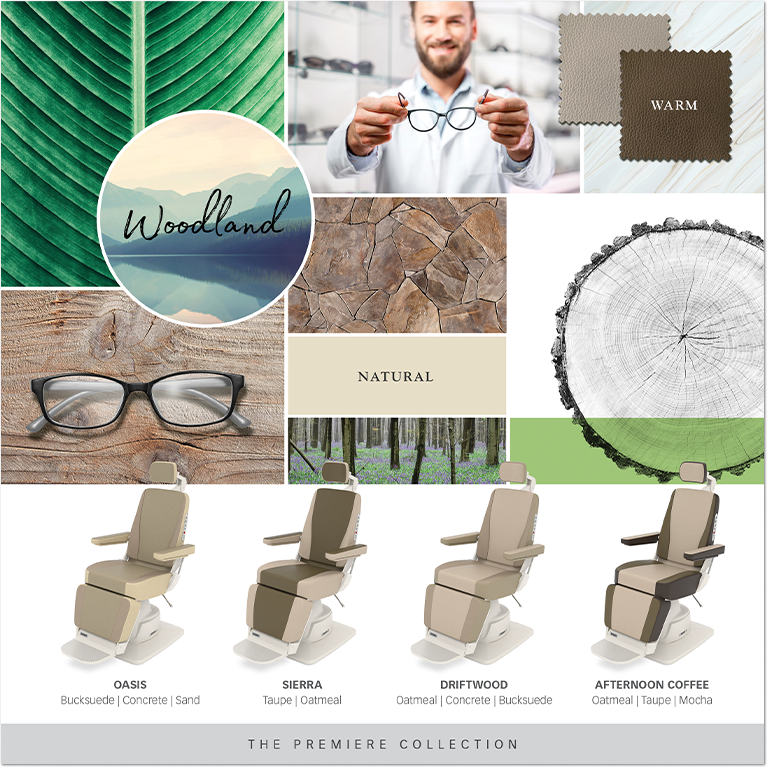
We concepted four chair styles: Industrial, Lucent, Woodland, and Harmony. The names and narrative for each came from a unique inspiration of visual elements and sensory appeal.
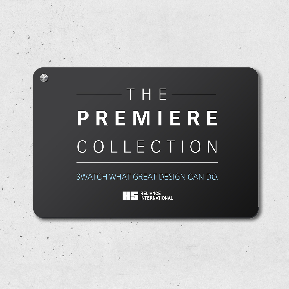
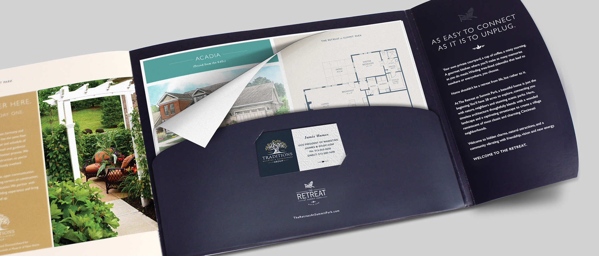
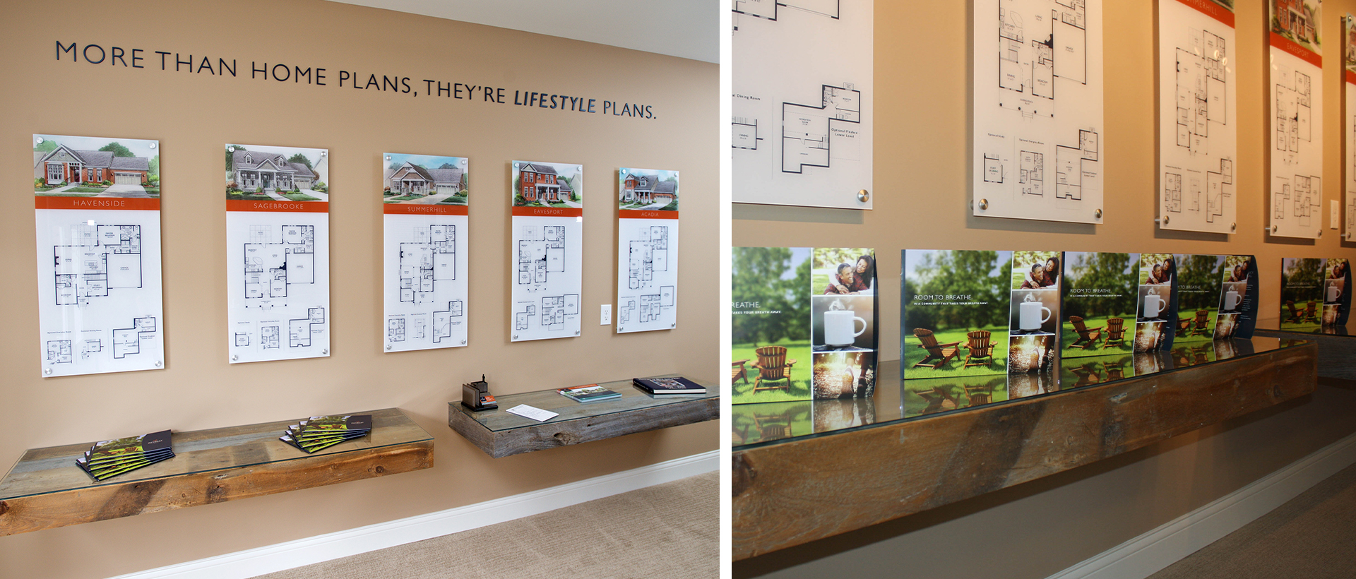
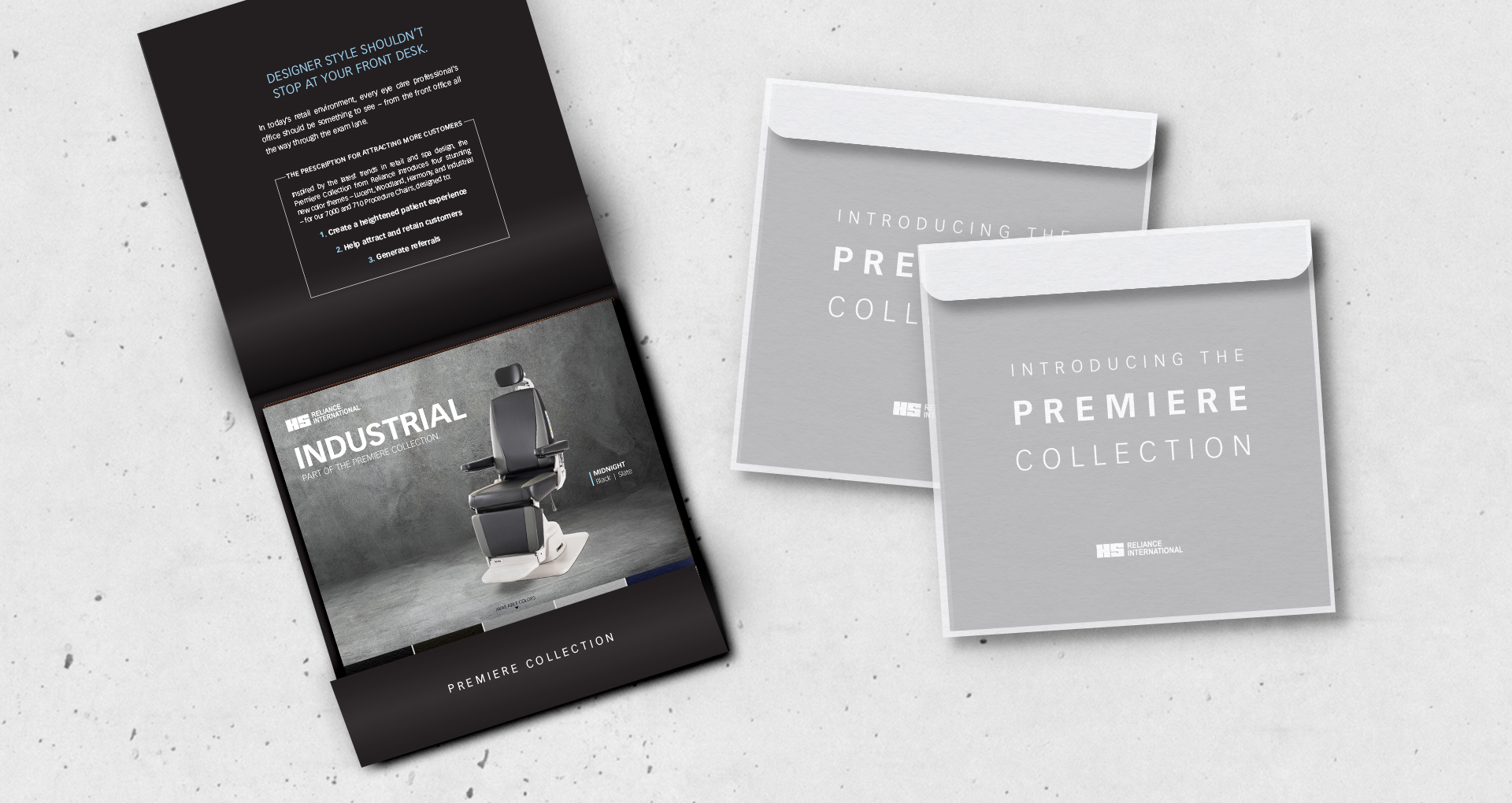
To highlight the bold new designs and features of the Premiere Collection, we created inspiring digital and print assets, from swatch books to trade show videos to direct mail. We also developed a digital sales tool for laptop presentations.
Of course, we communicated the benefit to the physician – setting one’s practice apart with designs that reflect a unique sense of personal style, making patients feel more welcome, and adding legendary Reliance durability to the office.
We succeeded at putting customization and modernization in the hands – and minds – of our prospective customers, making it easy to envision how the Premiere Collection could transform their practice.
The Premier Collection made its debut at the ASCRS show. The designs received rave reviews, and the sales team was excited about the interest and sales potential.
We created high impact direct mail featuring inspiration and photography for all Premier Collection designs: Industrial, Lucent, Woodland, and Harmony.
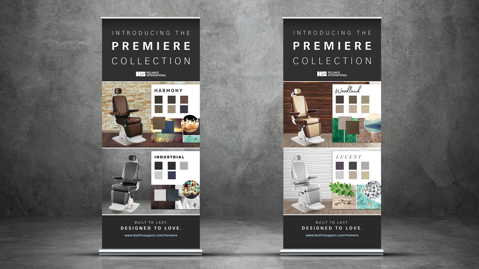
Sales tools featured a swatch book and beautiful microsite communicating the benefits of modern aesthetics in a practice’s clinical setting.