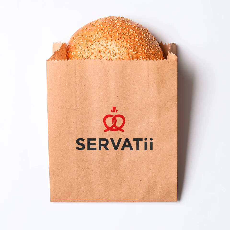
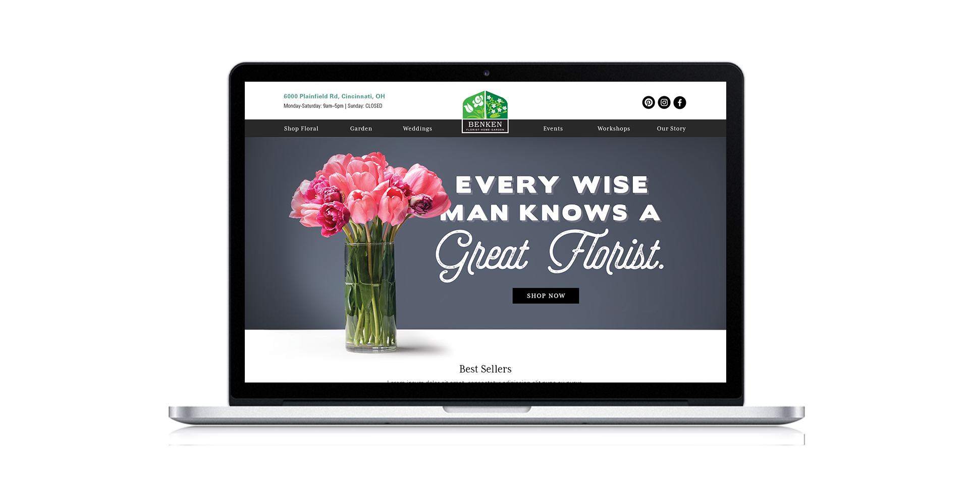
Servatii
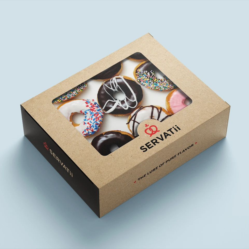
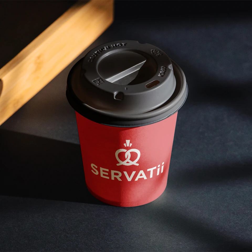
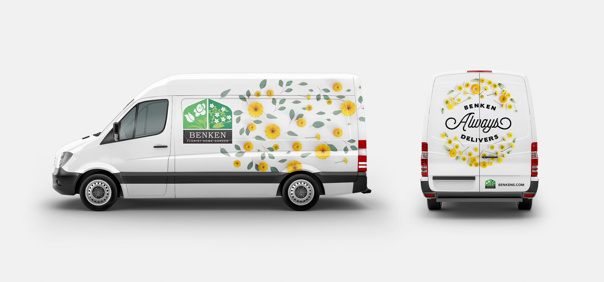
Brand Refresh, Website, Packaging, Display, Social, Email
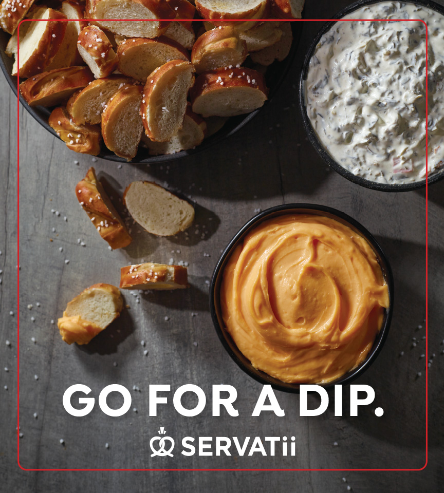
The no-fakery bakery.
CHALLENGE: Whip up new enthusiasm for the iconic Servatii brand while staying true to the bakery’s heritage and loyal following.
IDEA: Spotlight Servatii’s steadfast dedication to European-style techniques and authentic ingredients. Romance their craft to rekindle customer cravings and give younger audiences a taste of the extraordinary.
STORY:
For five generations, Servatii has been a go-to family bakery throughout Greater Cincinnati. But while its pastries have stood the test of time, its customer base was aging. Meanwhile, younger consumers were being lured away by the convenience of grocery chains and the novelty of niche bakeries. Servatii needed to rise to the occasion to stay relevant.
Our mission was clear] modernize the Servatii brand to attract a younger clientele without alienating its loyal regulars. No easy feat.
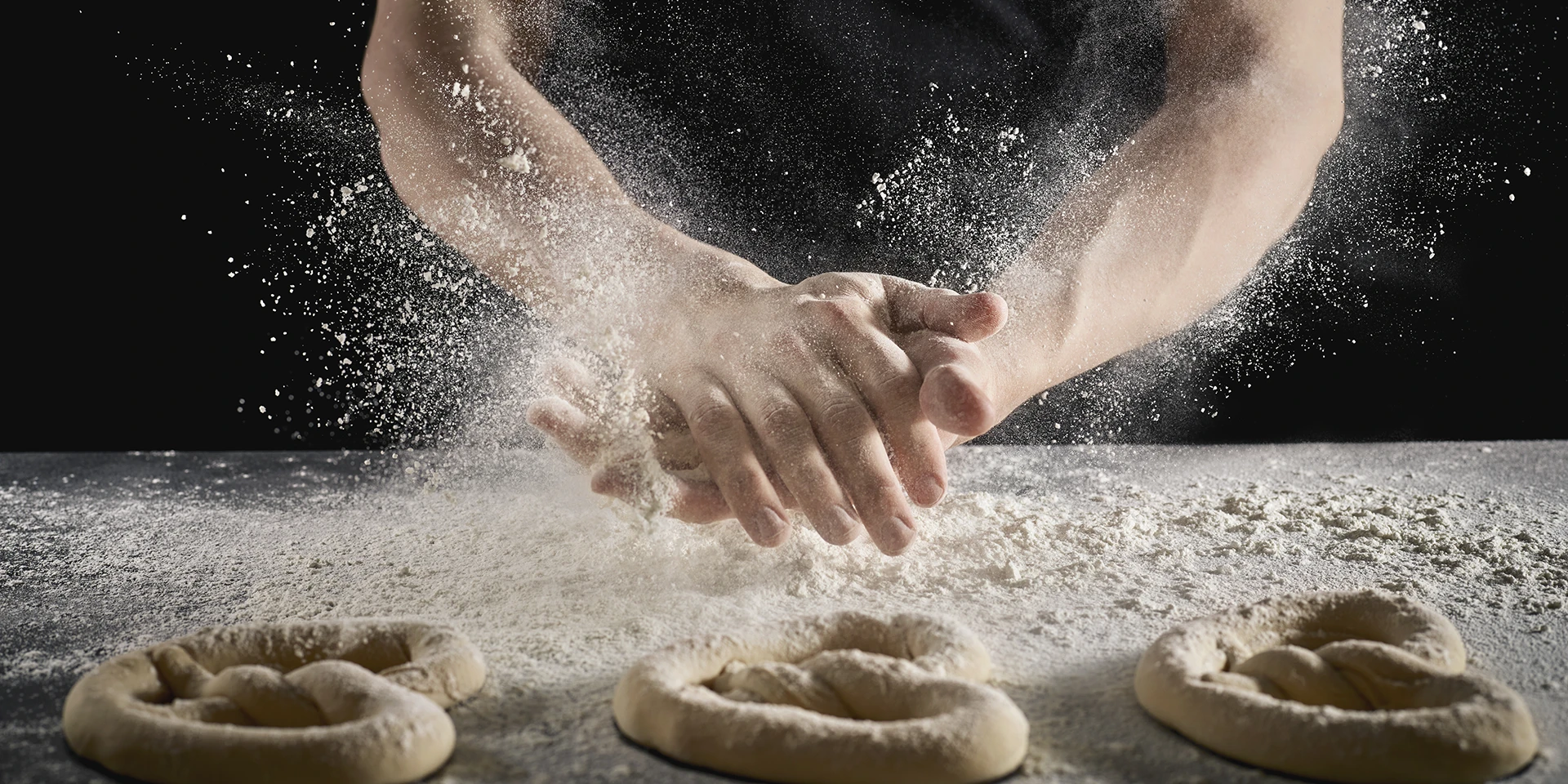
We rolled up our sleeves and immersed ourselves in all things Servatii, savoring every fresh-made pastry, pie and Bavarian pretzel (sure, that meant a few extra trips to the gym, but duty calls).
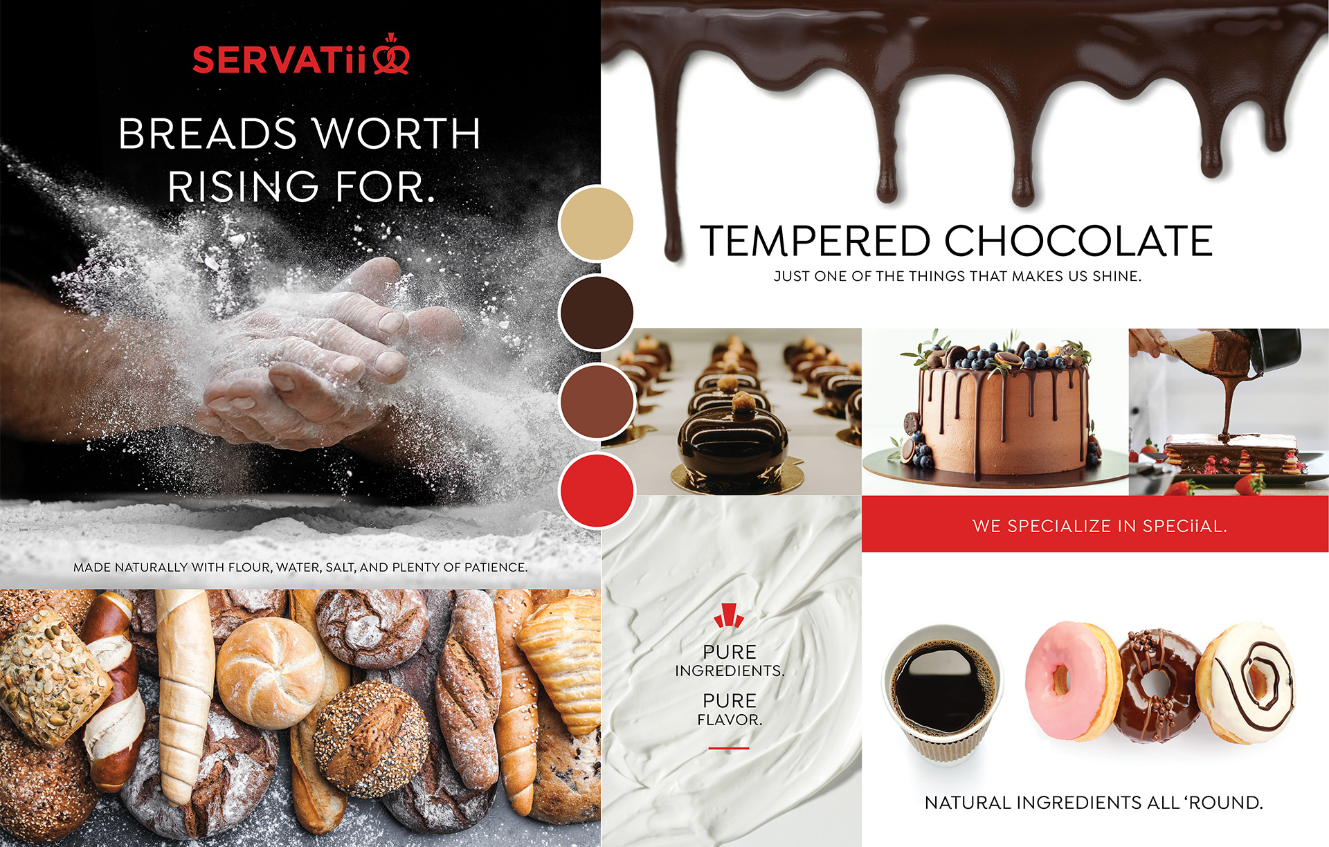
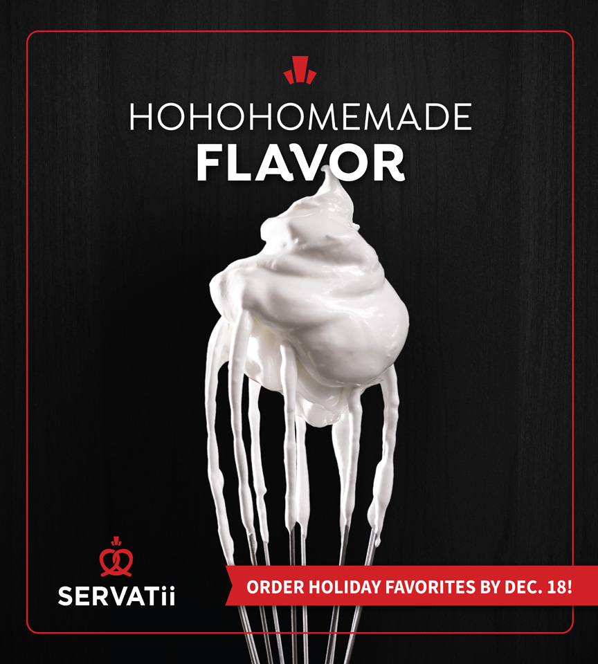
Here’s what we uncovered – shortcuts are forbidden in the Servatii kitchen. When your pastry chefs have trained under Europe’s finest, you use pure cream butter even if it costs more. You proof breads for 24 hours because that’s what taste and texture demand. And you never, ever compromise on quality.
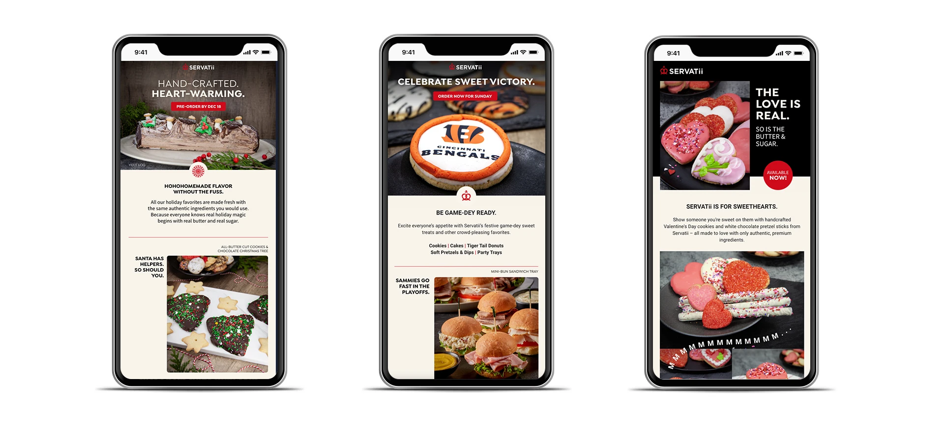
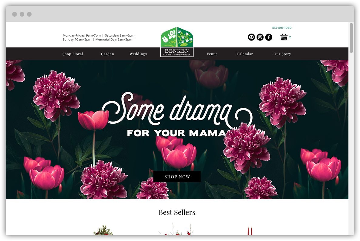
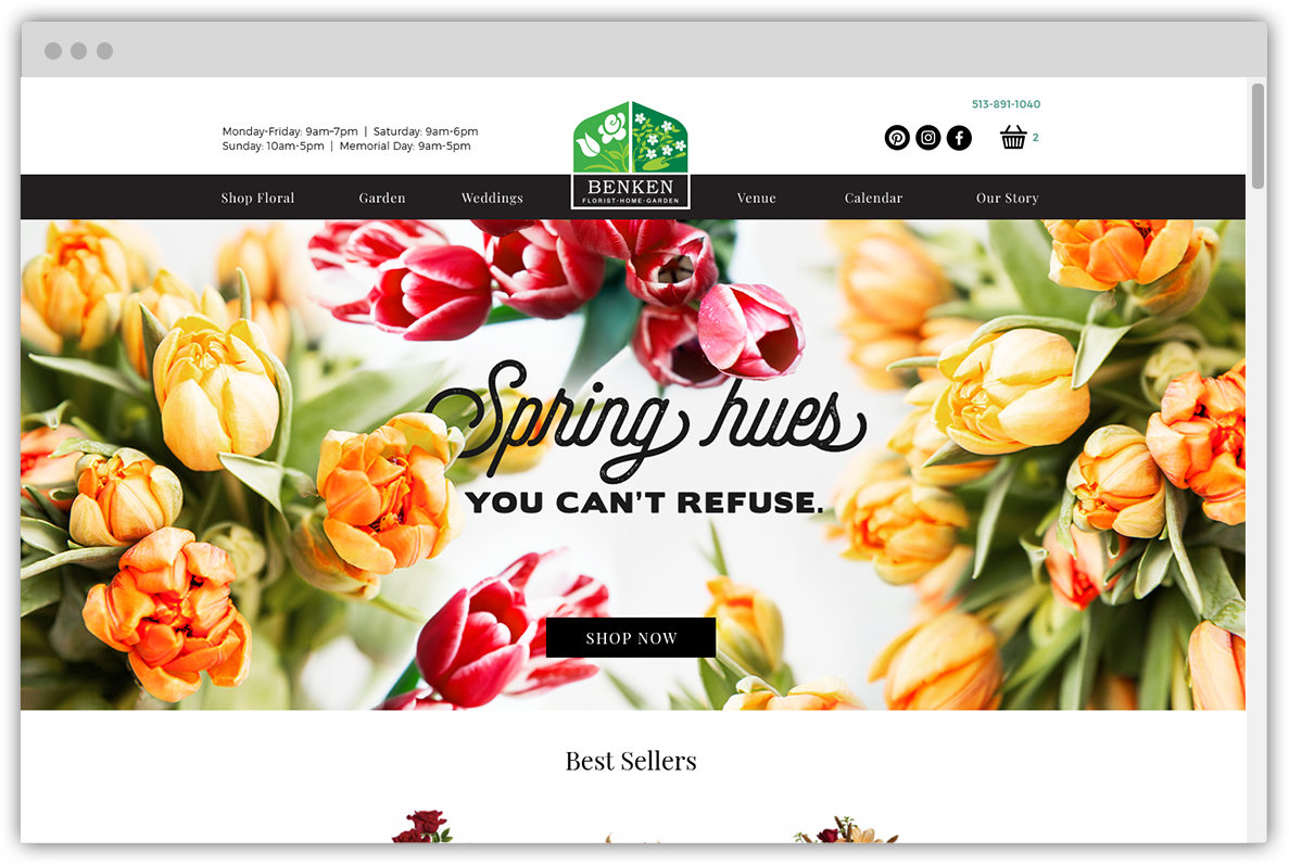
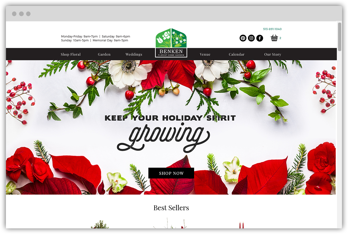
This absolute dedication became our North Star as we set out to refresh the Servatii brand with everything from a new logo to new photography to new messaging for an engaging social media strategy and creative campaign.
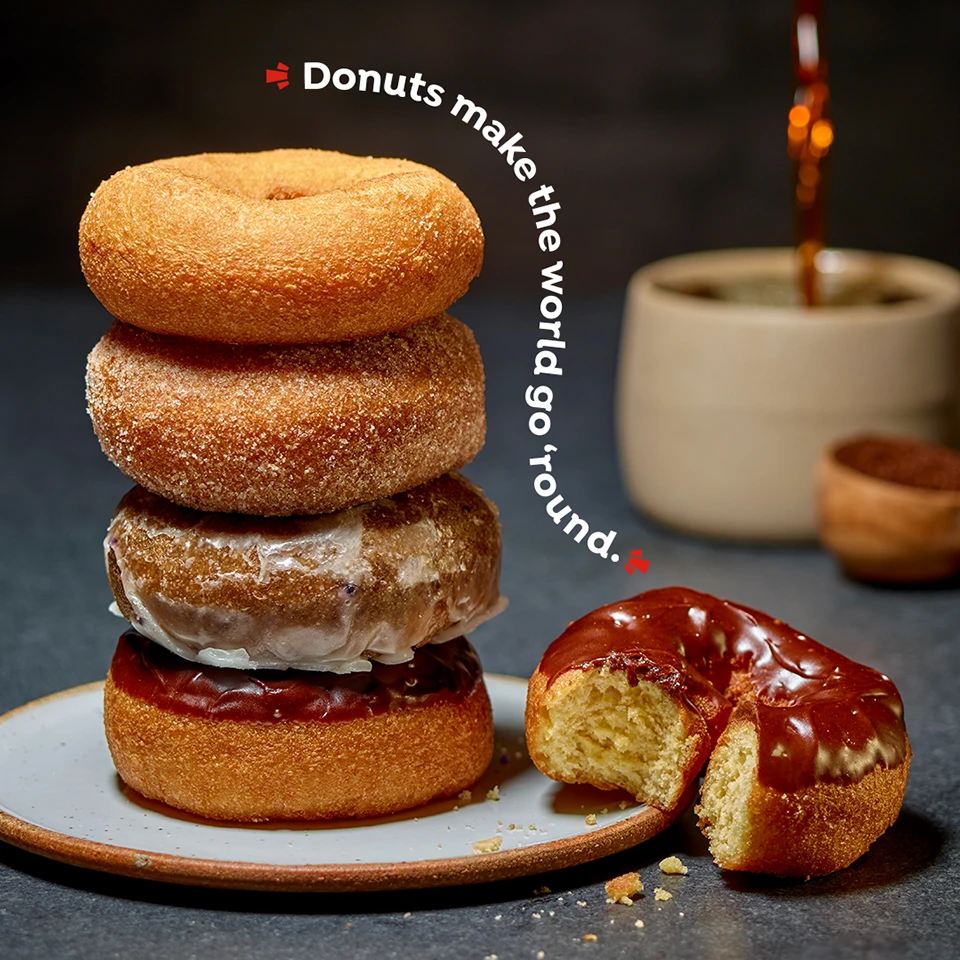
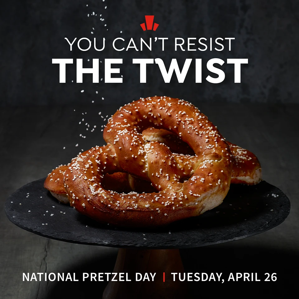
The result? A brand that honors Servatii’s past while positioning them for the future – a promise that every fresh Bavarian pretzel, every flaky donut, every creamy cheese pocket, is a labor of love, crafted to be savored and celebrated.